

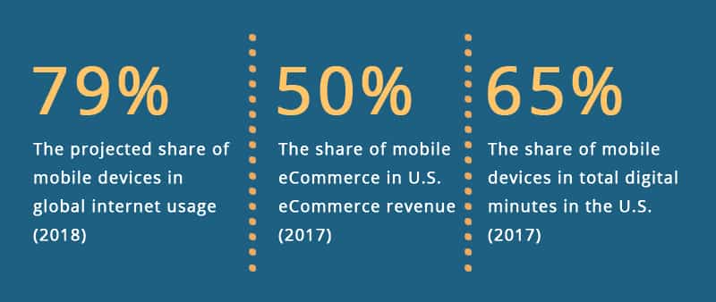
When it comes to e-commerce purchases, a large number of users are shifting from desktop websites to the “app” versions of popular e-commerce platforms like Amazon, eBay, etc. In 2017, approx. 72% of e-commerce purchases were made using a desktop, but this doesn’t mean mobile sites will go into an oblivion. More so because the global mobile population now amounts to 3.7 billion unique users. With stakes this high, chances are that you already have a mobile site. But if you don’t, here’s why should seriously think about getting one built, without further ado:
- The number of phone users is expected to reach 4.68 billion by the next year.
- Last year alone, mobile devices accounted for close to 50% of web page views across the globe. Goes without saying, the numbers have surged ever since.
- If surveys are anything to go by, more and more shoppers now turn to smartphones for convenience and/or to save time.
- With consumers spending more than 5 hours a day on their smartphones, you have enough time on hand to win them over. Why let go of the opportunity?
- And guess what, worldwide, more people own a mobile phone than a toothbrush.
Sources: Statista, Consumer Technology Association, and AdWeek)
What’s wrong with a desktop site, you may ask. Nothing. Yes, absolutely nothing. It’s just that the times are changing, and so should you. How else would you explain why:
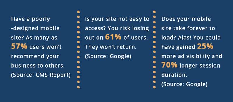
- Over 50 percent of search queries worldwide now come from mobile devices.. This is what Google has officially confirmed. Need we say more?
- Customers, as many as 51% of them, use mobile devices for discovering new brands and products. If you continue to hang on to a desktop site, you risk losing out on a big chunk.
- Mobile bounce rate is actually lower than it is for desktop.
- Average smartphone conversion rates are up 64% in comparison to their desktop counterparts.
Sources: BrightEdge and SimilarWeb
Then again, even if you get hold of a leading mobile & web development company, the mobile site they come up with may or may not serve the purpose, at least not during the upcoming holiday season. That’s because, the site has to be all set to handle the supposed influx, while evoking the coveted festive feeling at the same time. And if it doesn’t, make no mistake, it won’t do you any good, not when Thanksgiving is here. To be honest, don’t expect much traffic on Christmas either.
That said, all is not lost, not yet. There’s still time for you to get your mobile site ready for the holiday season. Here’s how you could go about it:
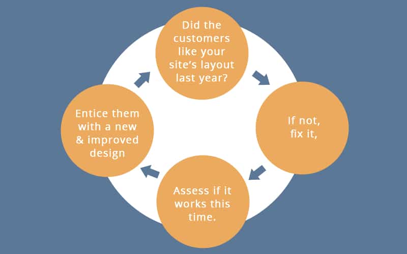
1) Put last year’s data to use
Find out what worked and what didn’t, and not to mention, the ebb and flow. Start off with Google Analytics. Doing so would help you distinguish the desktop users from the mobile ones, thereby making it easier for you to assess. Also, the data you fetch from analytics would paint a clear picture:
- The holiday season goes on for a while. It’s important for you to know when exactly did your mobile site experience an increase in traffic last year. Depending on whether it was November or December, focus on the month that wasn’t as fruitful.
- Also, no two days are the same. So, it’s very much possible that the holiday uptick may not have remained consistent. If there were drop-offs, even if temporary, take note. And if the traffic did fall, it would have returned to normal at some point. Find out when did that happen.
- Was there a rather surprising increase in your traffic? If so, what worked for you? What all sources contributed to the increase? And yes, the sources do matter, but so do the other metrics. Especially the important ones such as bounce rate, time spent on your site, and the pages visited.
What worked for desktop users may or may not have gone down well with their mobile counterparts. It could be anything, right from promotional free shipping to targeted banners. It’s imperative for you to weed out the least successful promotions. And this is only possible when you have the previous year’s data at your disposal.
2) Ponder over the navigation
“Whatever can go wrong, will go wrong” – Murphy’s Law
Here’s the kind of navigation that you definitely don’t want for your mobile site:
- One that’s hard to comprehend. Having too many pages and categories is okay, but making it an overwhelming choice is not. Your site’s navigation should simplify things for the users, and not add to their pain points.
- Navigation that has no special tabs to mark the holiday season. Don’t leave your users in the lurch. Help them get to the content they are looking for, without much ado.
- One where the users have to fend for themselves. A hotline or the lack thereof could make all the difference. The visitors have a lot of questions, especially around the holiday season. Don’t make them wait for the answers. It’s important to keep the communication channels open. Whether, it’s a hotline number, or a “contact us” tab. Anything and everything will do, as long as the users get to reach out to you.
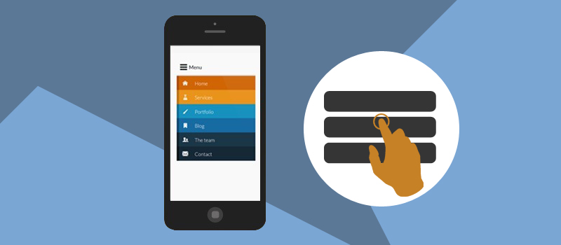
Now that you know what wouldn’t work, make sure you switch it with something that will:
- High-level tabs informing the users of what’s in the offing.
- Shortcuts to parts or pages that are of utmost importance to them. The users get to visit these parts right away, and what you get is a rather faster conversion. It’s a win-win situation.
3) Place add-ons at checkout
The checkout process is better left untouched, well, at least, for the rest of the year. But then, the holiday season is an exception, so to say. It’s that time of the year when you can try and experiment with an add-on or two. Promo codes or free delivery options, whatever works for you. Expedited shipping and gift wrapping could also get you some extra brownie points. That said, an add-on could interfere with the UX of your site, no two ways about it. But it does convey the message that you want to make the holiday season as special as possible. Strike a balance. And it’s not only the users who have something to look forward to; even you can get the most out of add-ons:
- Float a limited-time offer, encouraging the users to shop sooner to cash in on your offer.
- Place a bar right at the top of your site. Don’t wait for the users to get to the checkout screen. Let them know in the very beginning that they are in for a treat.
4) Paint a festive picture
“To be, or not to be” – William Shakespeare
You could very well drive users to your mobile site with images. Or so it seems. Images could add a lot of pressure to your server, thereby affecting the performance of your site. Worry not, there’s a way out:
- Resize your images. Needless to say, the oversized ones can do more harm than good.
- Use compression tools, if available. The idea is to free up space that your images would otherwise occupy.
- Give lazy-loading a shot, but only if you are familiar with the user’s journey on your site. If the journey starts above the fold, you can defer the initialization of an image. Do make sure though that the image does load as and when it’s needed.
Go around and spread some holiday cheer. And what better way to do it than to use some images that evoke a festive feeling. Hubspot has cheerful examples of holiday homepage designs for you to refer to. Take a cue. The trick lies in not being so explicit because you don’t want to rub your global audiences the wrong way. They may or may not celebrate the same holiday as you. Play it safe.
5) Put yourself in the customer’s shoes
To drive a user to your mobile site, think like one. Here’s what a user would prefer:
- A homepage that forfeits the need for them to scour through the entire site. Make sure that everything of importance is right on the homepage for everyone to see. Furnish the holiday-related content, to begin with. And then move on to products, pages, and links.
- Don’t wait for the users to scroll. Many times, they won’t. Work on your above-the-fold content, and make mention of the holiday season, at least once. It could be anywhere, in the navigation or even in a blog link for that matter.
- Streamline the user’s journey from home page to conversion. The last year’s data could come in handy, and help you devise a pathway of sorts.
- When you do come up with a pathway, make sure it’s responsive enough for a user to follow without any difficulty.
But that’s only one way of going about it. Some businesses adopt a subtler approach, and let go of the in-your-face content for good. See what works for you.
The Backdrop
Words of Wisdom
Don’t go overboard. A dancing Santa or an animated chunk of text could draw flak. And so can a pop-up. Not to mention, the holiday music is a big no-no. Pretty much everything that doesn’t add to a user’s experience.
Leave It To The Professionals
SunTec India has had successful trysts with mobile sites experiencing high traffic. With years of experience in mobile & web development, we know what works. More importantly, we also know what doesn’t, and could ward off the buyers. Having spent $108.15 billion online during the holiday period last year, the buyers are on a spree. Not sure, how to attract them to your mobile site? Reach out to us at info@suntecindia.com.